Original ideas
I don’t want to be rejected, I don’t want to be denied
— Sham 69 (If the Kids are United)
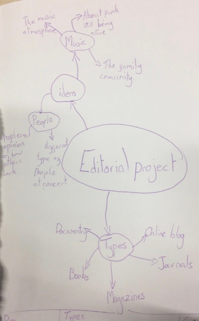
When I was set this project I started mind mapping what I wanted to experiment with and ideas that I had. I also looked at the pros and cons of different types of editorial material which I will insert below.
Types of material Pros Con
Books Something physical to hold Can be expensive
Magazine Not as heavy as a book Can be damaged
Journal Can be online or on paper Not as easily found
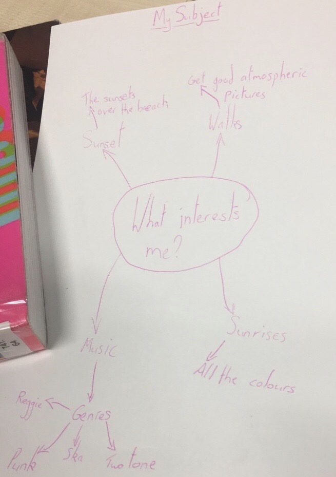
These two images are my original idea mind maps where I laid out all the ideas I had.
Saul Leiter photographer research
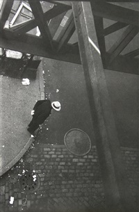
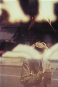
These are some of his images that interested me. What intrigued me about his work is the layout of the image and how sometimes the main subject of the image isn’t always in focus and that there always something slightly obscuring the main focus in the image. Whether it is being photographed through a window or from a far away height, this is something that I would like to experiment with.
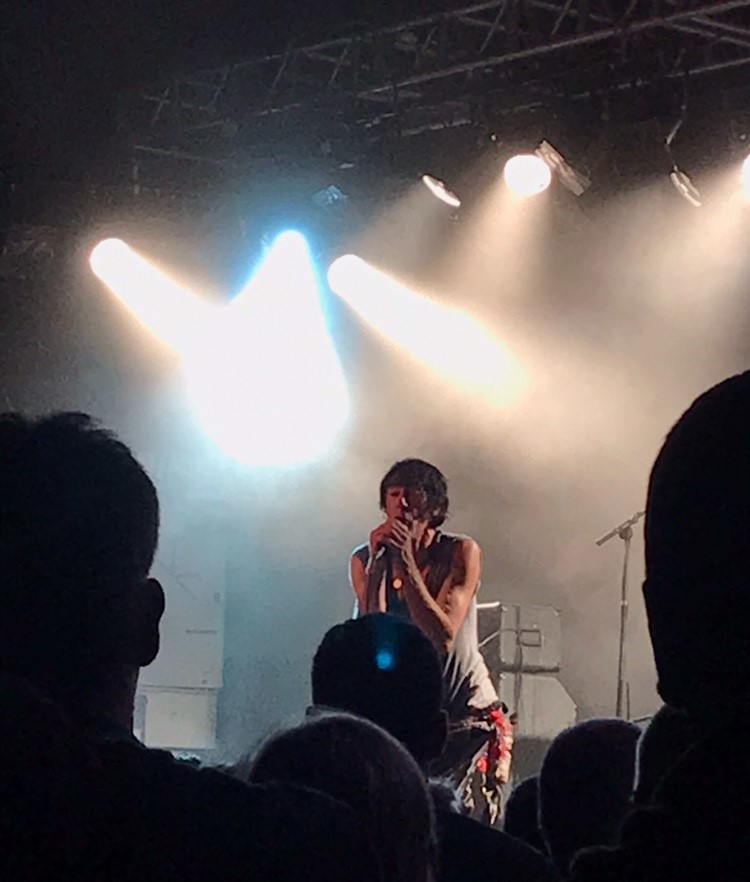
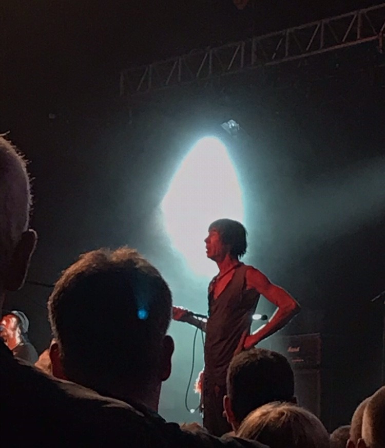
These are some images that I took for my artist response. When taking these pictures I stood back a bit from the stage and tried to get some people in the shot. Also the pictures are a bit blurry, but this is the effect I wanted as some of Saul Leiter were a bit blurry as well. I felt the blurriness added to the overall effect of the image.
William Eggleston photographer research
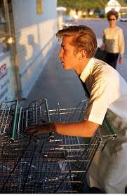
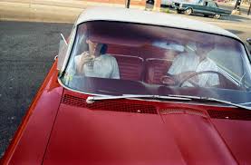
What I like about his pieces is the layout of them especially the image of the car as it is off centre but it works, if anything it makes the image look better as you cant stop looking at them. William Eggleston was a rather controversial photographer not through the work he produced but he was rather rude during interviews and was rather blunt and sarcastic. some people may be critical of his work because the car in the picture above isn’t central and isn’t central but others might say it is a unique approach that is different but in a good way.
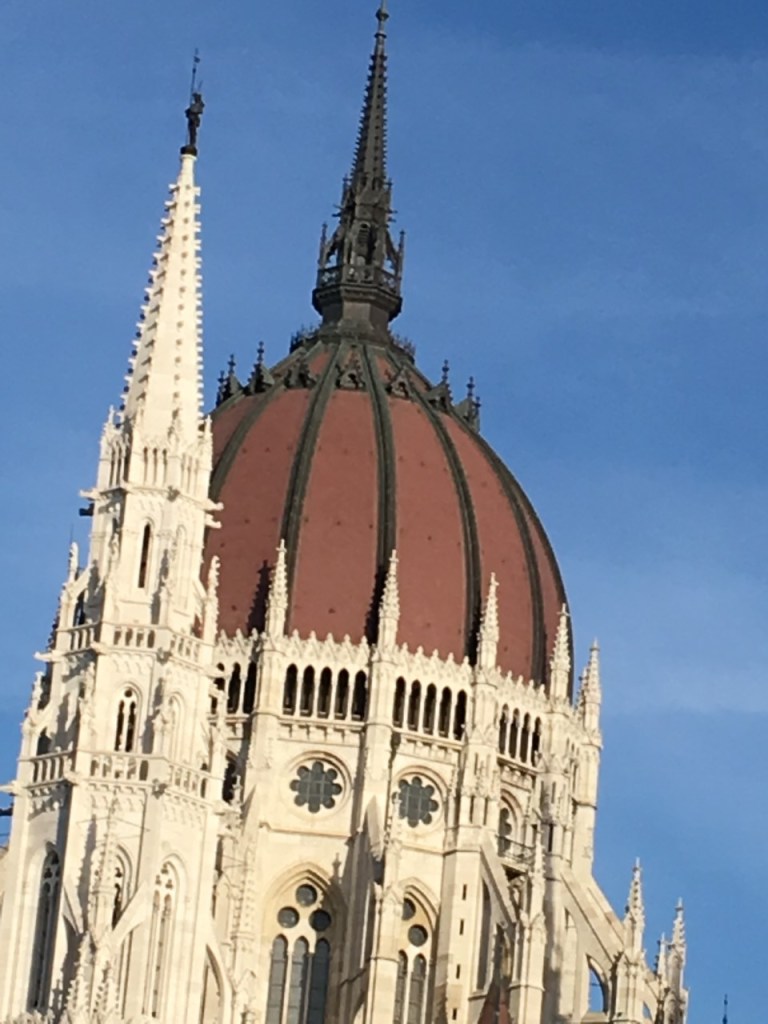
This is an image that I used for my artist response what I did for this response was I took an image not on a direct angle.
Eve Arnold photographer research
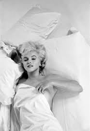
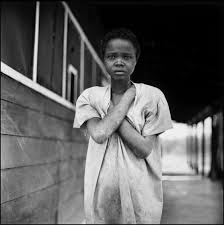
What interested me about this photographer is the diversity in her pieces, as she photographs both rich and poor classes and showing how class can effect people which really interests me. Some people may dislike her work as in the images above the fair skinned lady is photographed to look beautiful and is laid out in a seductive way whereas the other project is the almost opposite maybe she is trying to show the blunt truth through her photography.
Edward Burtynsky climate change photographer research
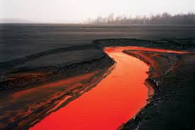
What interested me about this photographer is the colours used in his pieces as there usually not too many colours which is effective as it draws my eyes to I feel the main focus of the photograph which for me is the river. This is something I’d like to take further. This picture was achieved by polloution in the water that’s how the red colour was achieved.
Research into historical documentary photographer
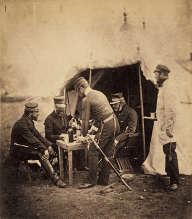
What interested me about this photographer was the position of the people in the image as none of them are looking straight into the camera they are all looking at the table with something we cannot see which obviously interests people.
What I will be doing next? I am going to be doing more experiments based on photographers I have researched.
What I did for my experiments? For these experiment I went to a music festival and took pictures of the type of people that were at the festival and how they responded to the music, it was interesting to see how people reacted to the punks that were at the festival.
Research into punk zines editorial.

What I liked about this zine was the homemade look of the piece and how DIY it is, this is something I’d like to experiment with as I love the homemade look of them.

This zine like the other one I liked because of the homemade feel this one is different to the other one as there is more pictures and it is a bit more cluttered than the other one, when I experiment with zines I am going to experiment with both an organised and cluttered approach, and after I have made them I can evaluate on which I prefer and why.
My experiments with people at Sheffield music festival. While I was at a music festival I took advantage of all the punks walking around and took some pictures of them while they were listening to the music to see how 21st century punks act at concerts to my surprise there wasn’t too much moshing but it was interesting to see the fashion and to get to know the people.
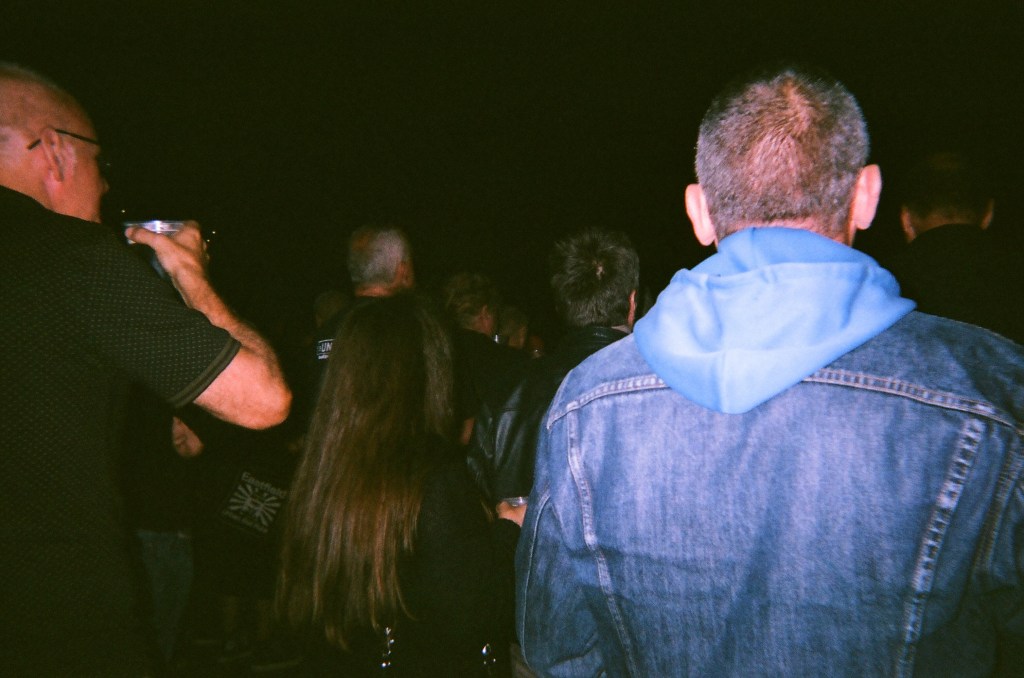
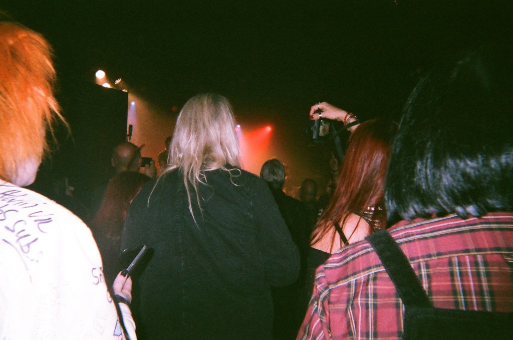
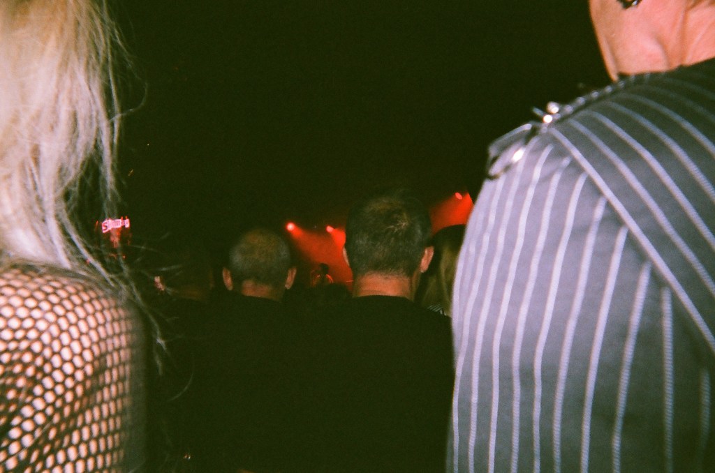
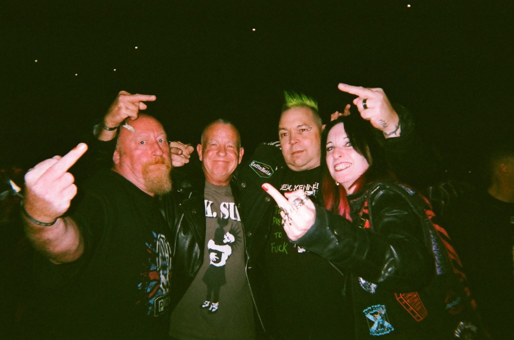
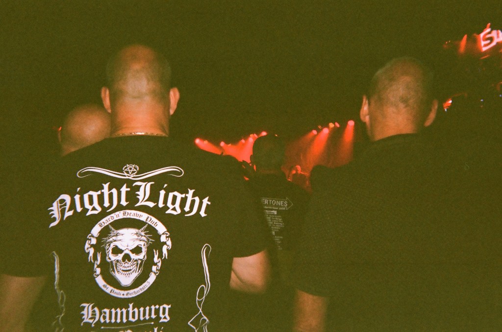
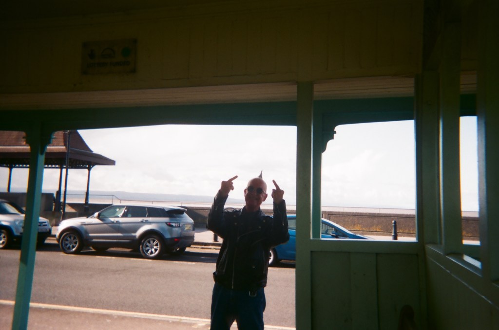
These are some the best images that I gathered from the festival I liked these images because the lighting was shown best in them.
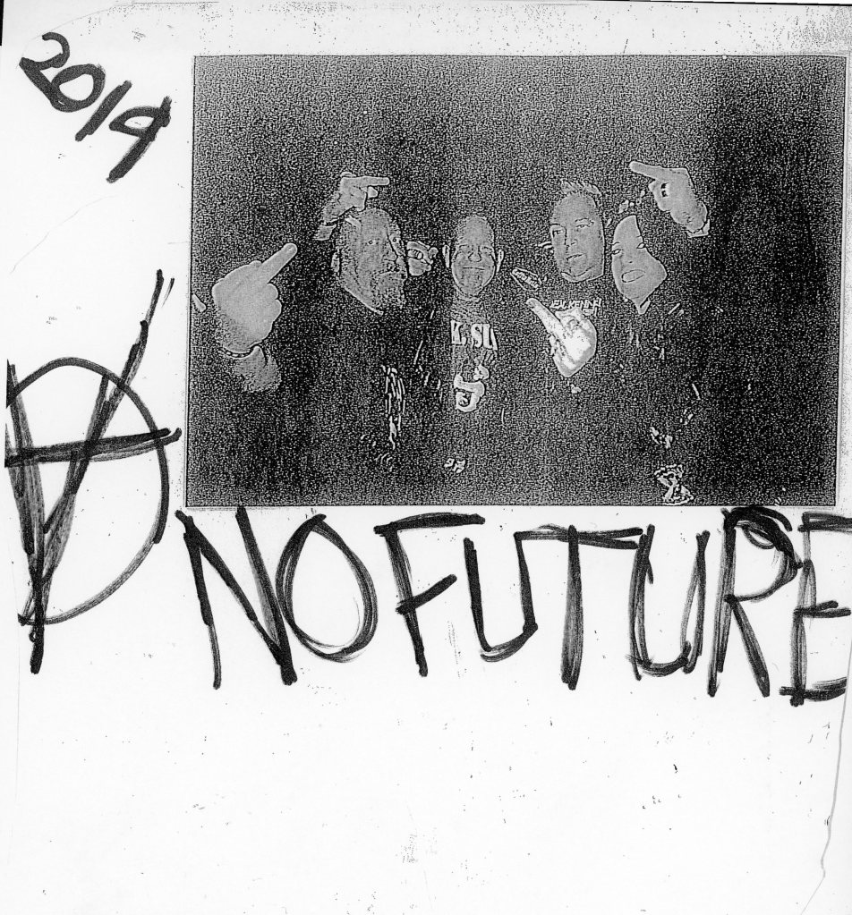
For this experiment what I did was I photocopied a picture that I took the festival a number time of times so it looked slightly pixelated and grainy and looked worn. I also wrote some slogans onto the page to make it look like a zine.
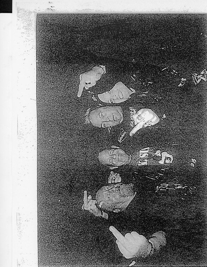
For this experiment I photocopied an image about 4 times in black and white so that I looked more vintage.
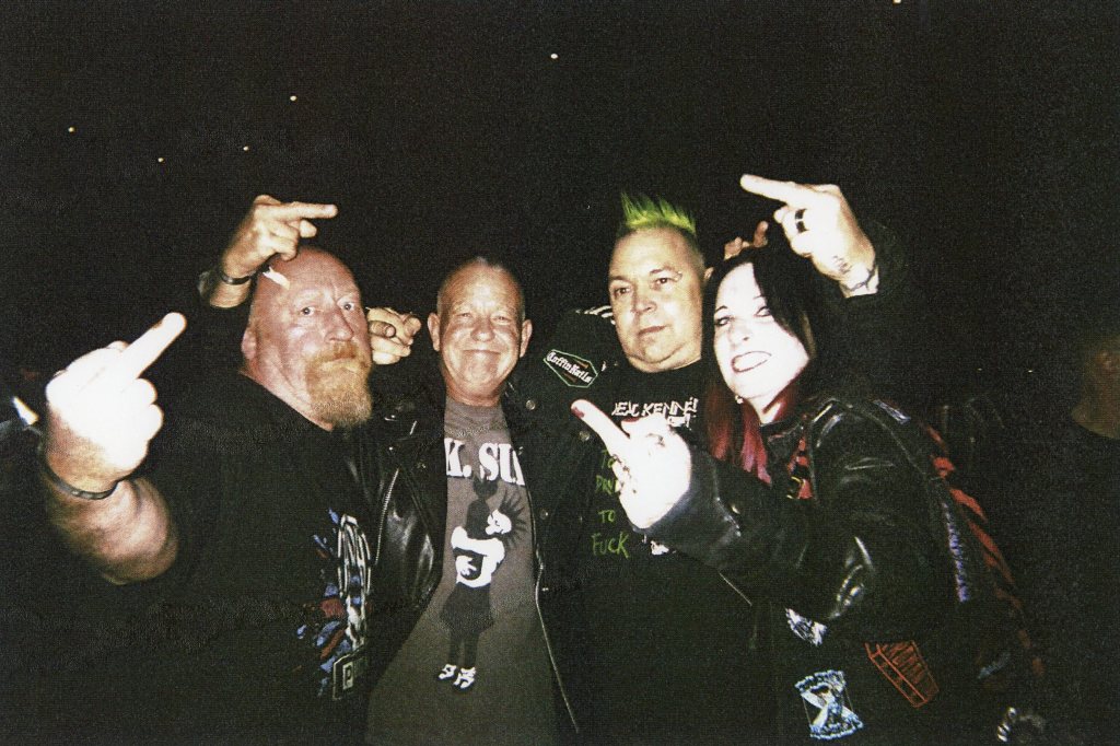
For this experiment what I did was I went onto photoshop and boosted up the contrast of the picture which made the picture more grainy and old looking which is something that I wanted to achieve as it looks more vintage.
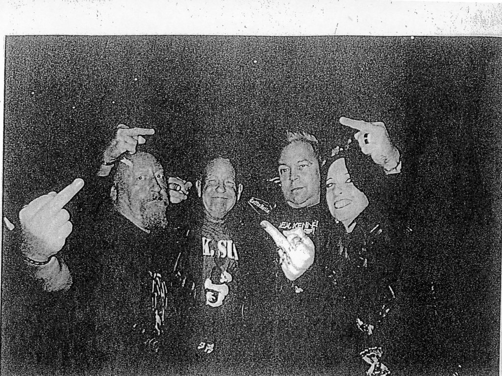
For this experiment what I did was I took one of my prints and photocopied it a number of times then I scanned it into the computer.
Why I did these experiments this way? I did them this way to make them look more vintage as back in the 80s when punk was happening everyone was creating punk images themselves so it was more DIY which is something I wanted to keep.
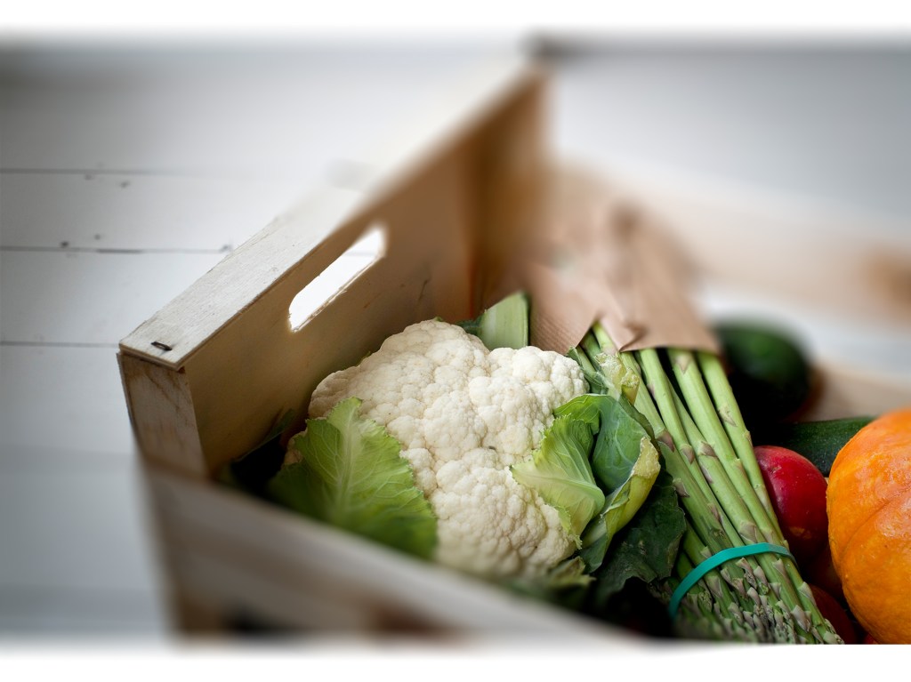
For this experiment what i did was I opened in photoshop this image and added a tilt-shift blur effect I got to choose how much of a blur there was and where the blur is located.
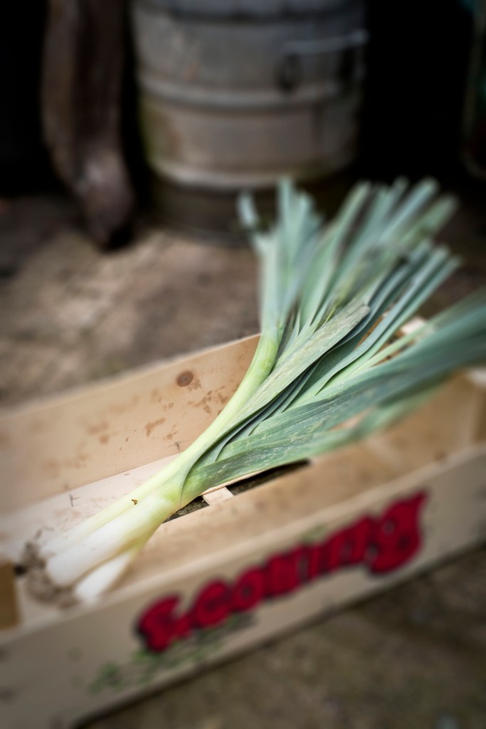
For this experiment I used the iris blur effect I am very pleased with how this piece came out as the blurry effect I feel looks very effective.
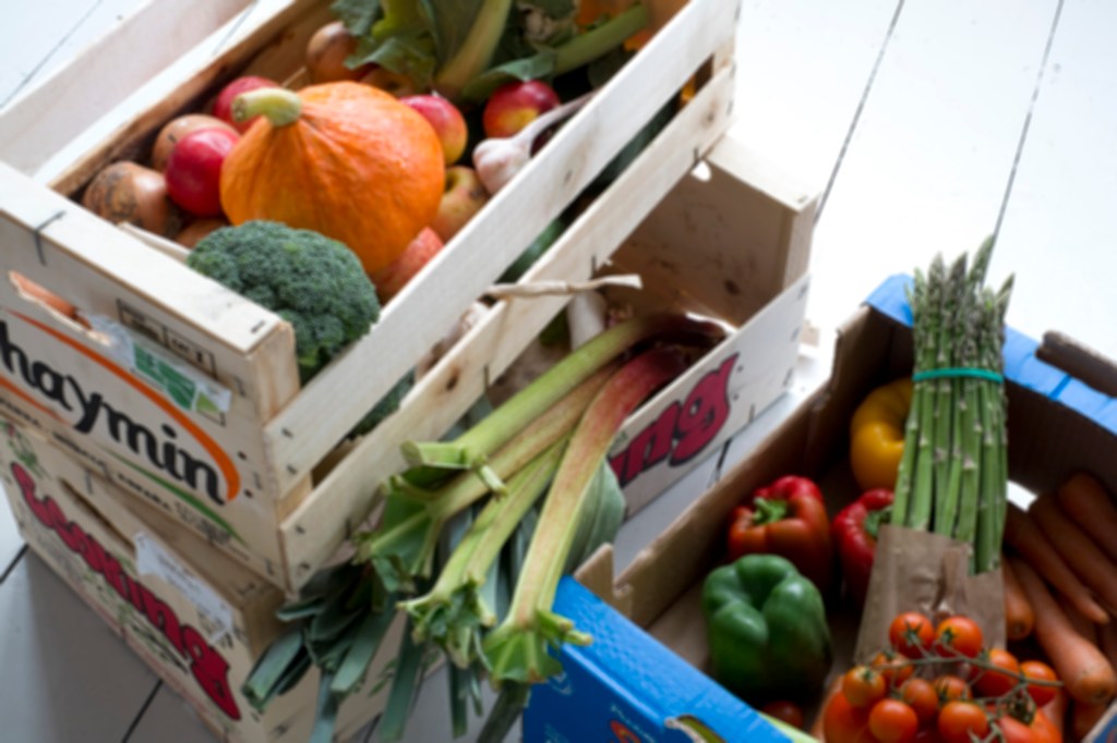
For this experiment I inserted one of the images and inserted the field blur effect which made it slightly blurry but in a good way.
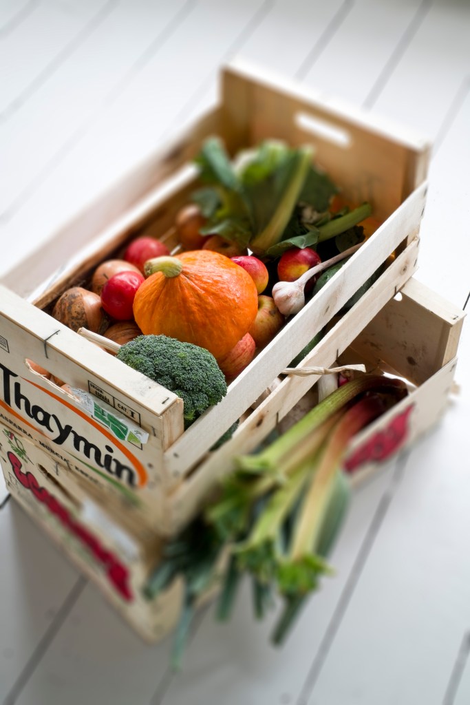
This is another tilt-shift experiment I did I like the way that the image came out and the overall look of the image is pleasing.
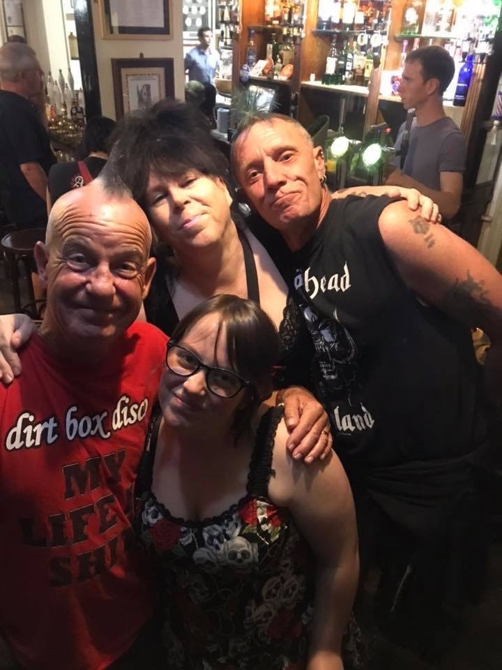
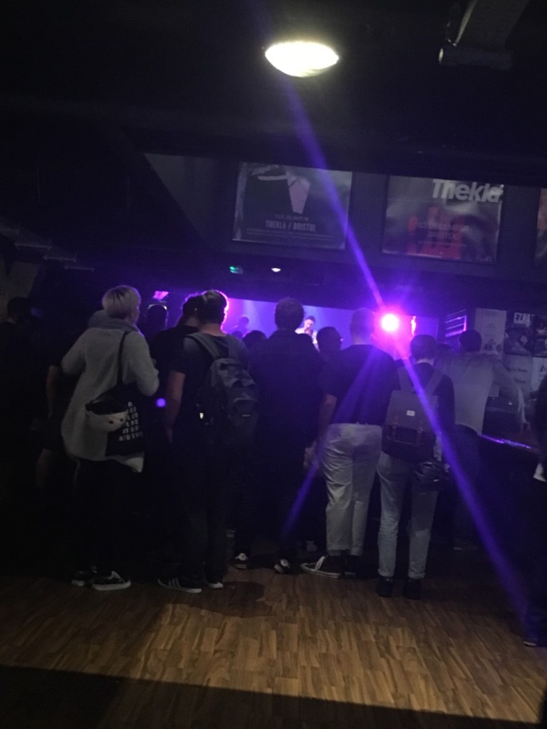
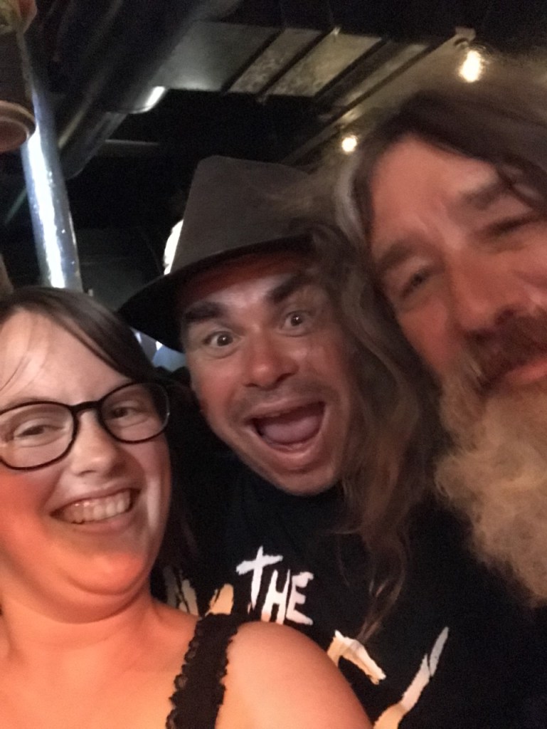
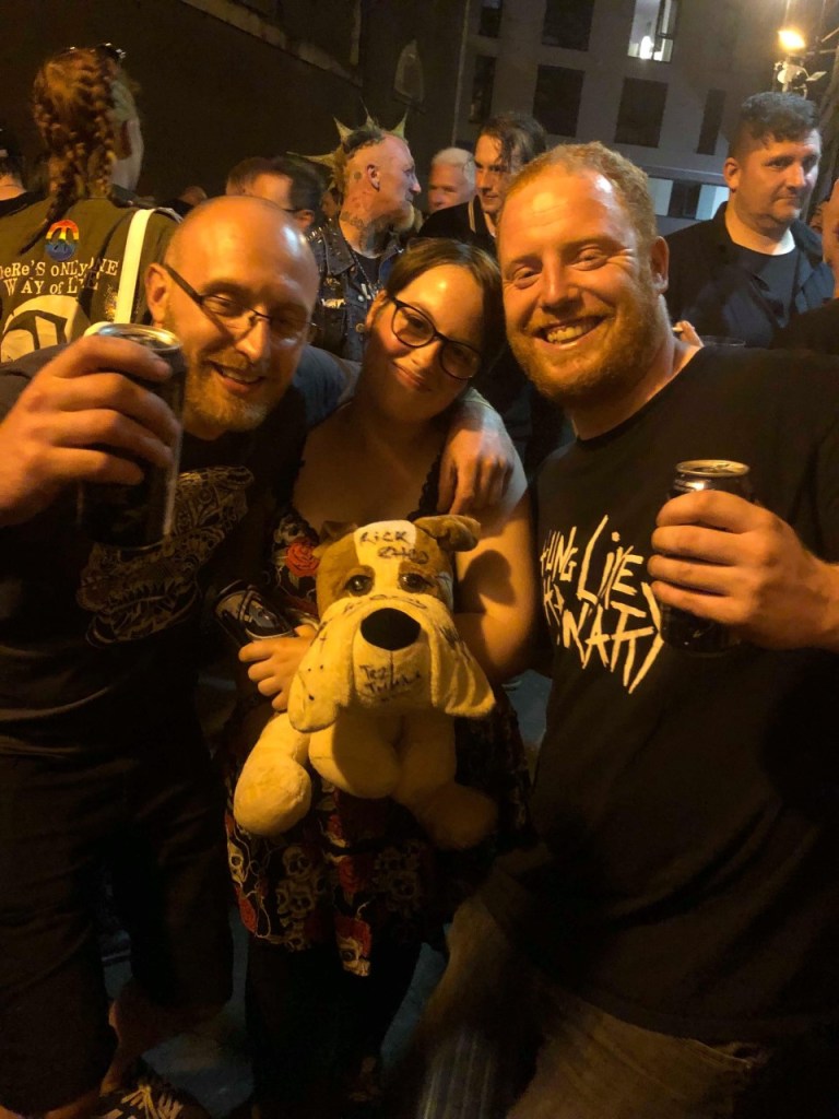
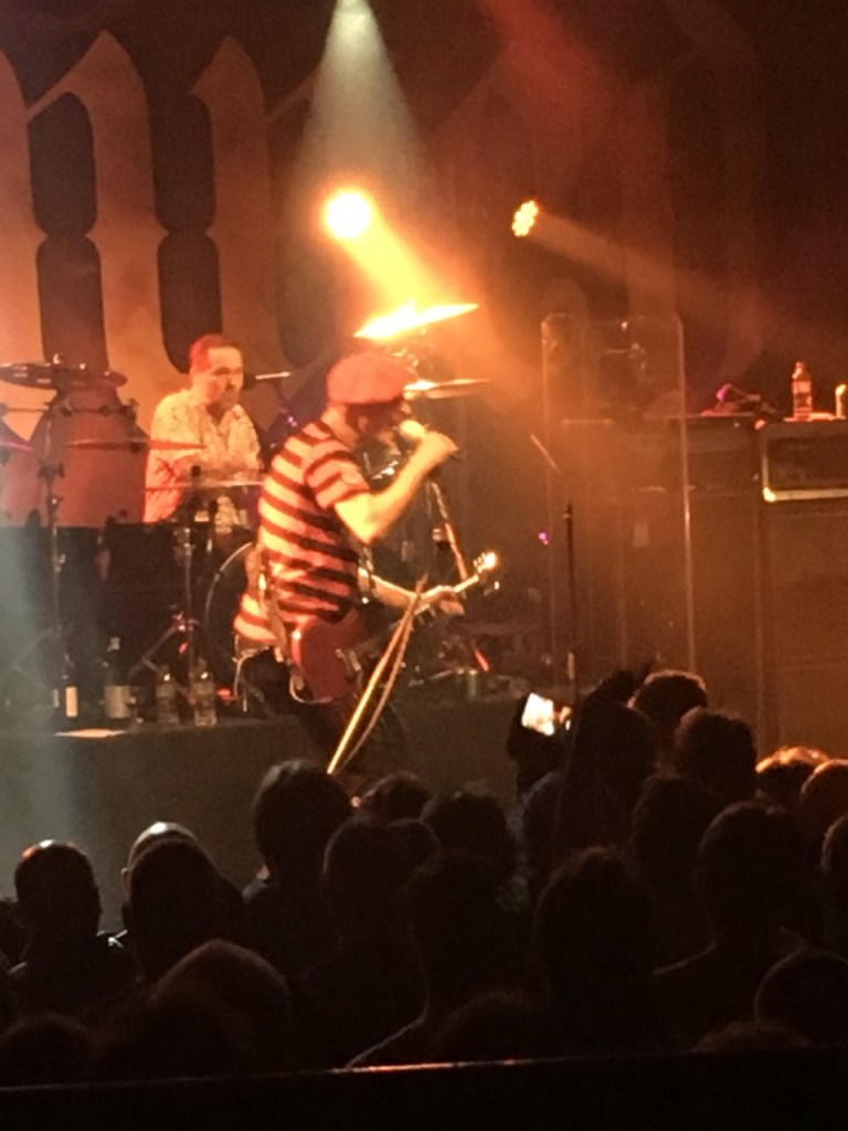
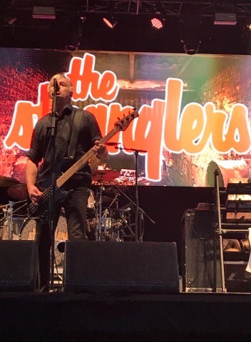
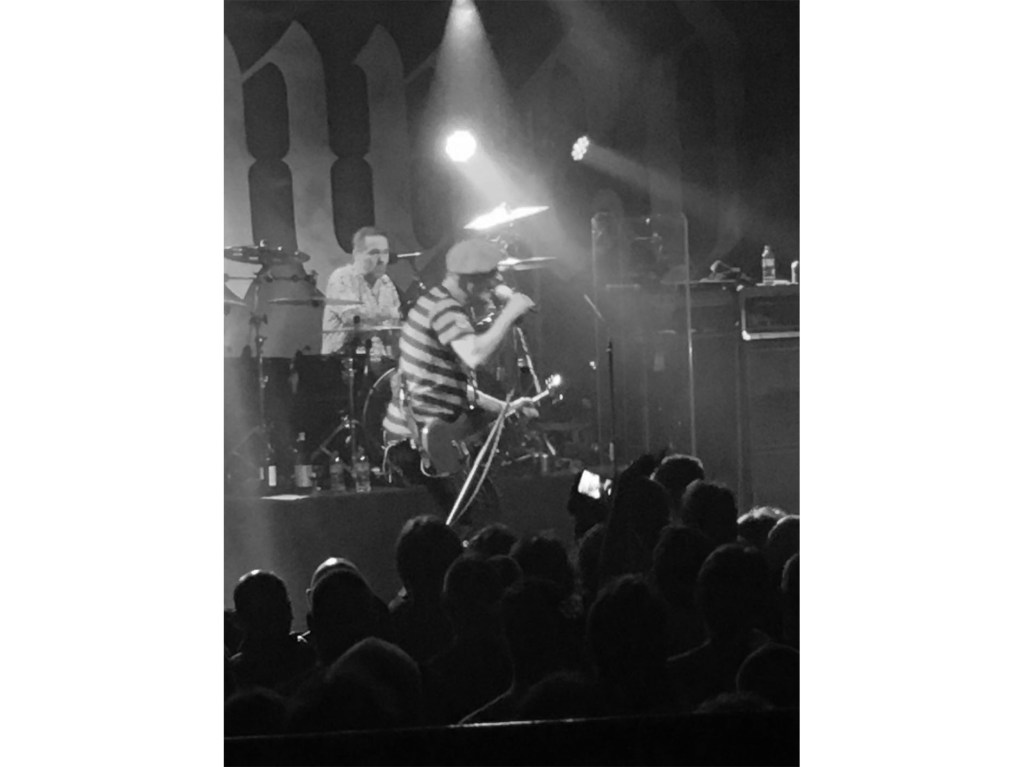
These are some extra images I took at some concerts of the crowd and some of my family.
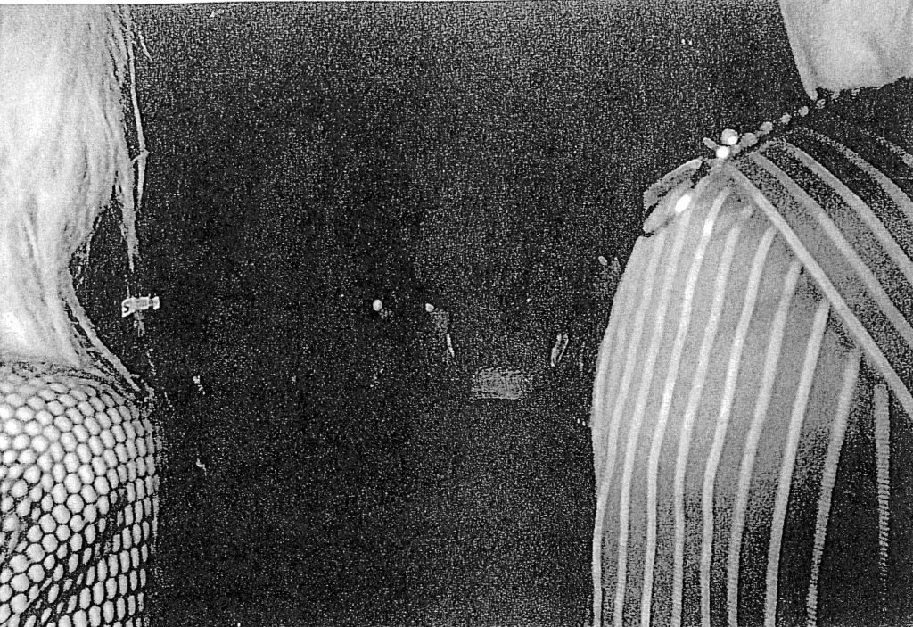
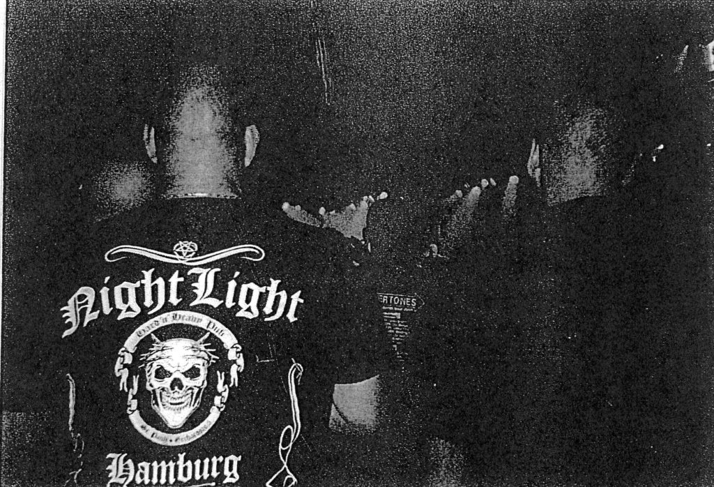
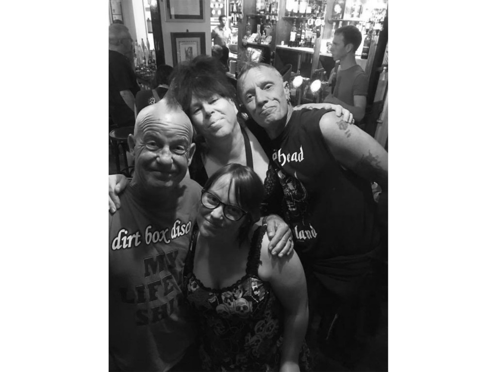
For this experiment I took some of images I have and turned into black and white and I also photocopied some of them to make them look distressed and old.
What is the plan next? I have been making a newspaper article which I am combining with the other people in our class to create a full newspaper which we can have. I also hope to go out and take more photographs of people at concerts and the atmosphere around it.
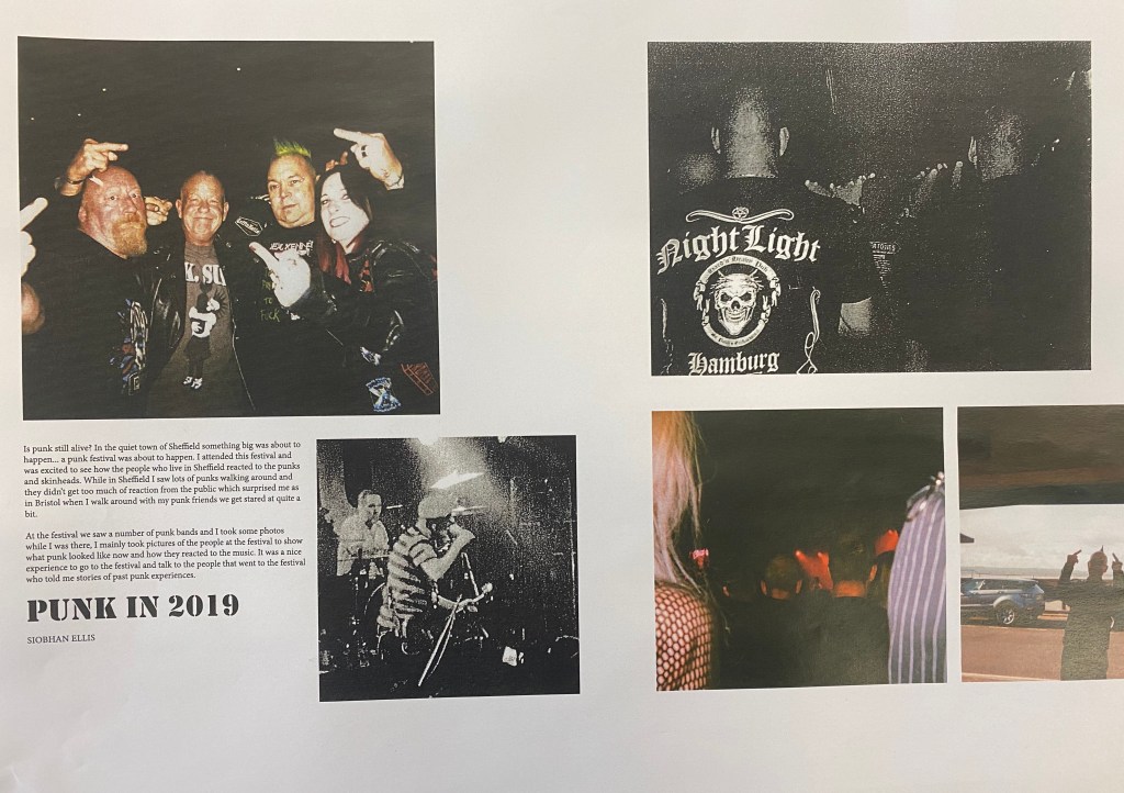
This is the final layout that I made for my newspaper article I created this in Adobe InDesign this was interesting to create as I got to use something that I haven’t used before so I learnt new skills. What I liked about my layout is that I feel that the images complement each other as I arranged it in such way that the black and white images are supported by colour images. Somethings that I felt that could be improved with my layout if I had more images from the festival I went to then I could have done some more experiments and included some different images in my layout.
 Editorial Project